

The hubby and I are celebrating our 3rd marriage anniversary today, yay! Since we tend to prioritize “experiential” presents more than actual “stuff”, we agreed to put any anniversary funds towards an upcoming weekend getaway instead of getting each other actual presents.
However, I still felt like we should mark the day itself with a little something, and so I whipped up a cute and fun infographic covering what all’s happened over the past three years of our marriage. I posted it to my hubby’s Facebook wall this morning, and he was pleasantly surprised, and we’ve gotten a lot of great comments from friends and family as well.
If you’re looking for a quick and inexpensive present idea, this is certainly a great one for that, and you could even print it out and stick it in a frame to give as a physical gift, if you liked. Best of all, it doesn’t require any design skills! Here’s how I did it:
Step One: Gather the data points.
For the data points, you want to start out by thinking about what sort of hobbies or activities you and your loved one most commonly participate in and enjoy.
Armed with those ideas, I looked to two main sources for inspiration for our data points: Facebook and Mint. On Facebook, I was able to scroll through our photos looking for trends. I could see that I posted a lot about our home renovation projects and travel, so I quickly counted up the number of home diy projects we’d done, the number of camping trips we’d taken (and the fact that they always somehow turn out frigidly cold…), and that we’d taken 19 out-of-state trips and vacations since we got married.
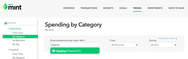
Next, I went to Mint.com, the budget management tool that we use to track our finances. I was able to go into the “trends” section and look at spend by category, and sub-category until I noticed a stat that stuck out: we’d had 51 transactions from our favorite pizza delivery place since we began using Mint (which we started using just after our wedding, when we combined finances.)
There’s no limit to the types of fun stats you may be able to come up with. If you use a budget management tool, you can easily find stats like # of movie dates, # of times you’ve gone to a favorite restaurant, # of Uber rides you’ve taken, etc.
If you don’t track your budget in this way, you could go to some of your most common vendors and look up your order history – Amazon.com, for example would have lots of interesting info on most of us. If you watched an entire tv series together, go to bingeclock.com and see how long you spent doing that together. If you both use a fitness tracker religiously, you could even calculate your total # of steps. Just get creative, and you’re sure to find some interesting options.
Step Two: Use an online infographic creator tool.
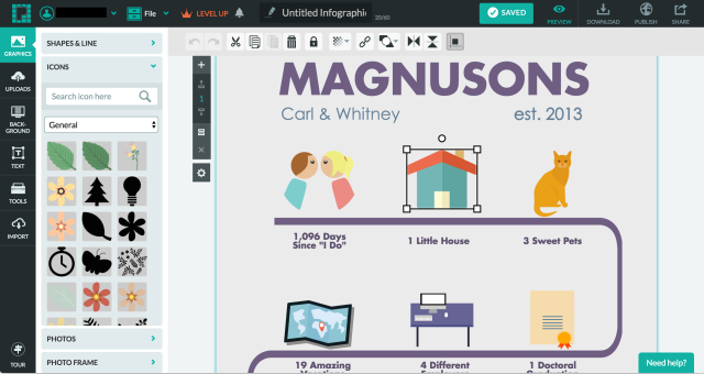
There are several of these out there, but the one that I used, which I found extremely simple was called Piktochart.com. You simply choose a template, and then replace the default text/icons with your own. They had a quite extensive library of icons available, and the WYSIWYG (what you see is what you get) interface made it very easy to drag and drop things into just the right place.
These sites are all free to use, but you may find that there are only a limited number of free templates available. Mine is on a free template, but if you want something with a little more pizzazz, you can also upgrade to a “premium” template for just a few dollars more.
So there you have it. All told, I probably spent 2 hours on this project, and it was fun and a nice surprise for my hubby. It would work for birthdays or other occasions too, just a matter of shifting your data points. Enjoy, and let me know in the comments what sort of infographics you’re thinking of making!